Redesigning for the 40% We Forgot — Case Study
Redesigning for the 40% We Forgot — Case Study
Redesigning for the 40% We Forgot — Case Study
Metanat Karami - Saeid Rezaei - Arezoo Karamooz
Metanat Karami - Saeid Rezaei - Arezoo Karamooz
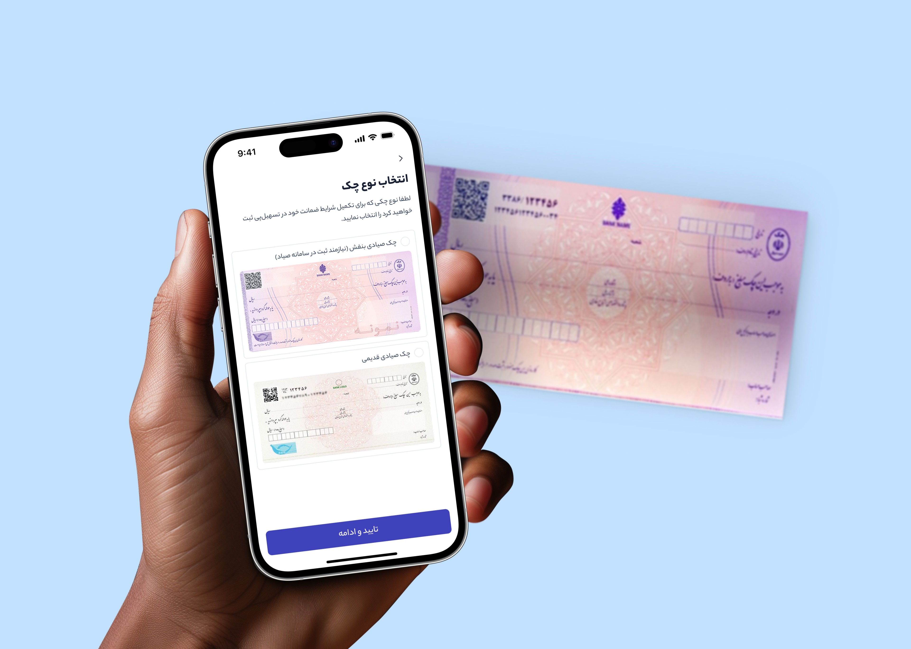
Tashilpay is a platform that digitalizes the traditional high-amount loan process through automation and a user-centered design. After launching the first version, we received feedback indicating that the guarantee cheque registration process was causing significant user frustration due to frequent errors and the time-consuming nature of the task. To address these issues, we initiated a redesign to streamline the process, reduce errors, and enhance user satisfaction.
Tashilpay is a platform that digitalizes the traditional high-amount loan process through automation and a user-centered design. After launching the first version, we received feedback indicating that the guarantee cheque registration process was causing significant user frustration due to frequent errors and the time-consuming nature of the task. To address these issues, we initiated a redesign to streamline the process, reduce errors, and enhance user satisfaction.
My contribution:
Product Designer
years:
2023
My contribution:
Product Designer
years:
2023
Redesigning the collateral cheque registration in Tashilpay resulted in a 32% reduction in time-on-task and a 83% improvement in error recovery. But more importantly, it reminded us that even when we think we’ve covered every scenario, users always have something new to teach us.
The problem
Tashilpay is a financial platform built by the Tashilcar team to facilitate the car financing process — from loan application to installment management. Due to the company’s fast paced environment and tight deadlines, the initial version launched without user testing. A few weeks after release, support calls spiked.
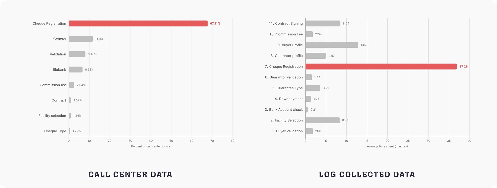
Data from the call center team showed that roughly 7 out of every 10 calls were about the collateral cheque registration step. User logs confirmed that this step took 8 times longer than any other part of the flow. The cheque registration is inherently complex and time-consuming, but the data made it clear: our design had failed to ease users through it.
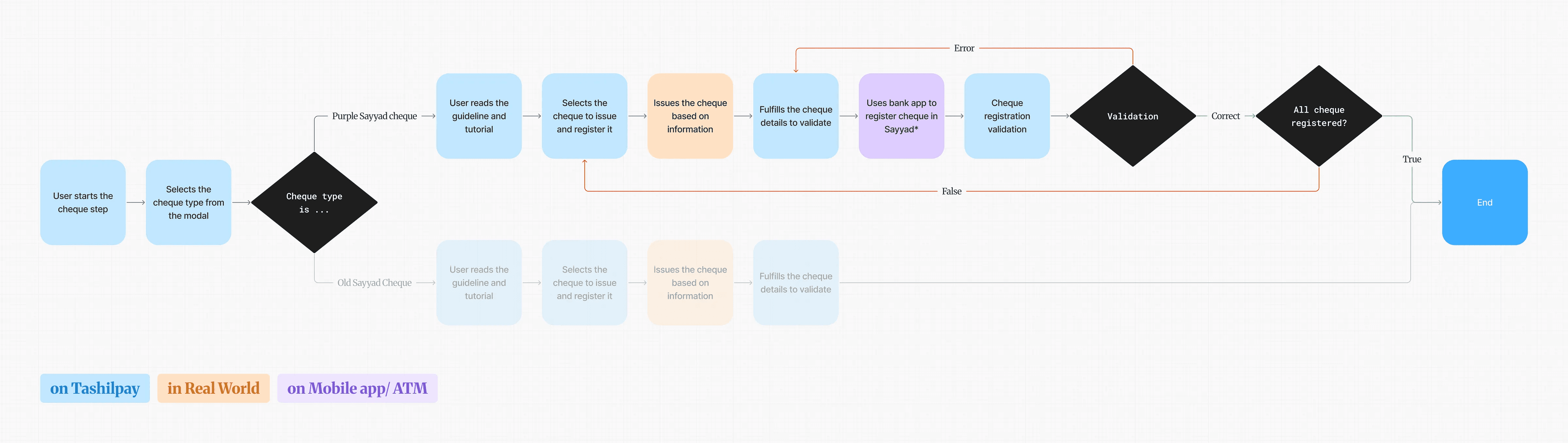
Sayyad is Iran’s centralized interbank cheque verification system, used to register and authenticate cheques digitally across all banks.
Discovering the issue
Before making any decision, we tried to extract as much information as possible from available tools. We had two main data sources:
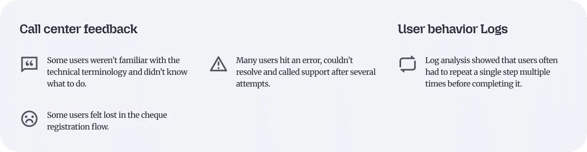
The data confirmed that a problem existed, but it didn’t explain the root cause. After aligning as a team, we concluded that the existing data wouldn’t be enough to solve this — we needed to understand users’ actual experience directly.
User research
To understand exactly where and why users were struggling, we ran usability tests with real users. The goal was to observe their actual behavior firsthand and hear thoughts directly.
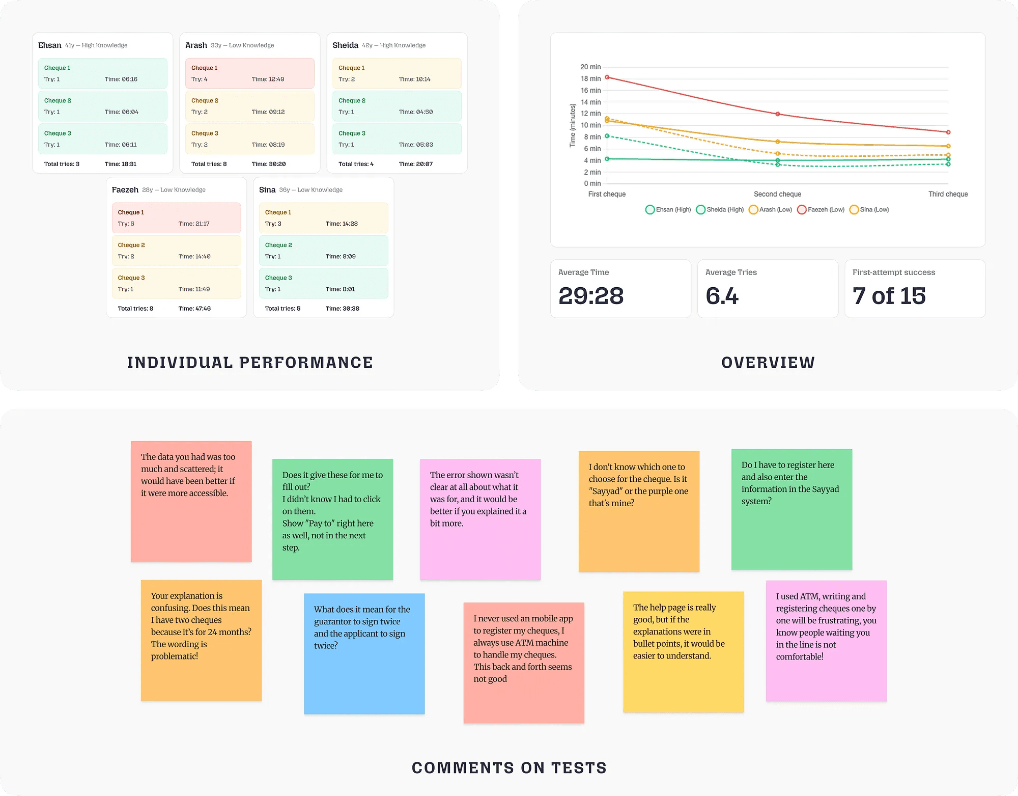
We invited 5 real users to come to the office and complete their actual collateral cheque registration, in person. To better distinguish between problems rooted in lack of knowledge versus problems caused directly by the design, we were intentional about who we invited: 2 users who were already familiar with the cheque process and 3 who were not.
Throughout the tests, participants were asked to think aloud as they worked and rate each task on a scale of 1 to 5 after completing each task. This approach allowed us to capture both their behaviors and their subjective experience of the flow.
Analyzing behavior
Data collected from the sessions revealed that a significant portion of the struggles were rooted in how users understood the process and how to complete it. That said, users became noticeably more comfortable after registering the first cheque — for the next cheques their errors and questions decreased. To map pain points more precisely, we used a User Journey Map. This helped us clarify UX challenges and identify opportunities for improvement.
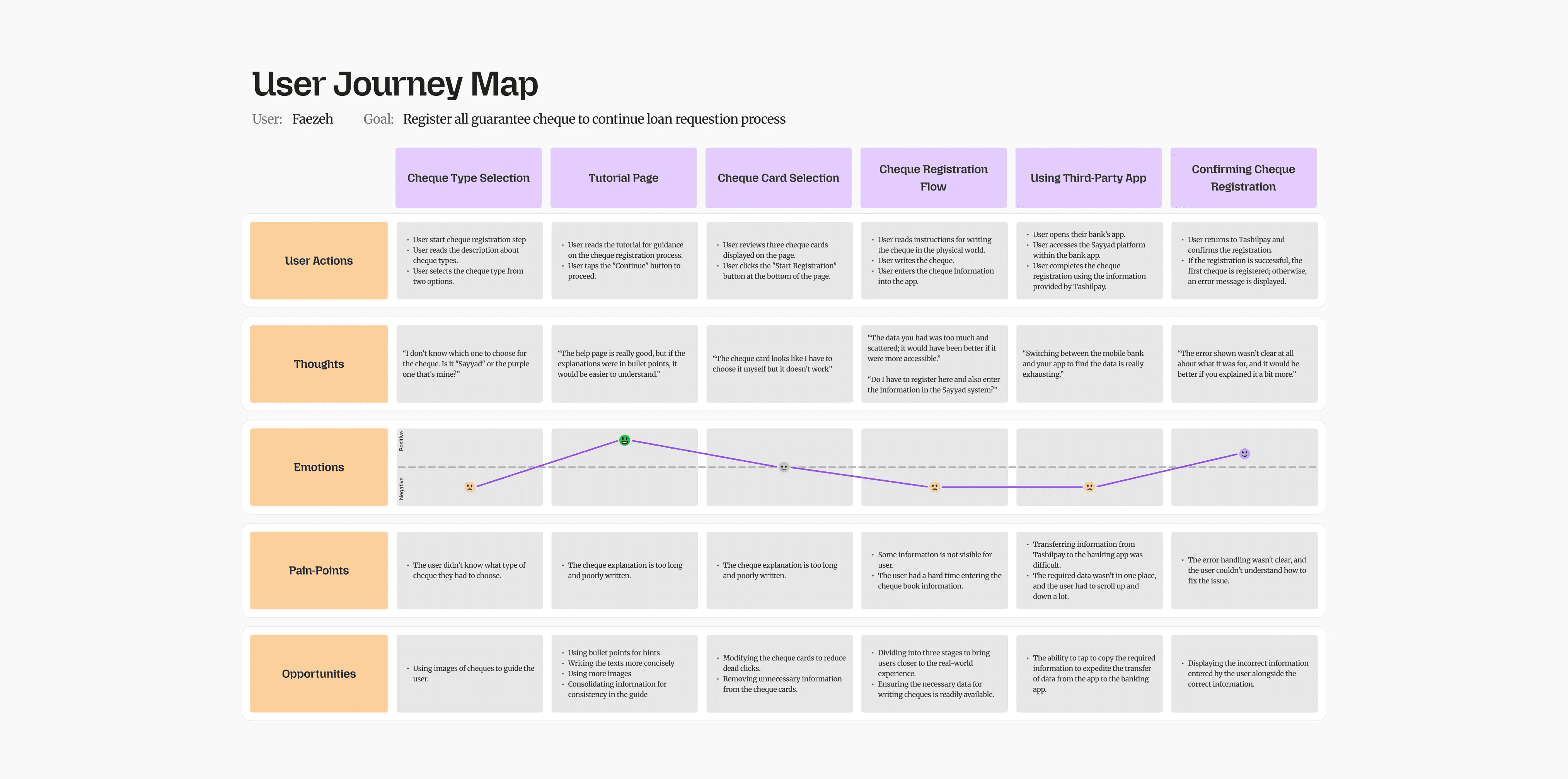
Observing user behavior showed that the designed flow didn’t facilitate the process — instead, it forced users into constant back-and-forth cycles.
Key findings
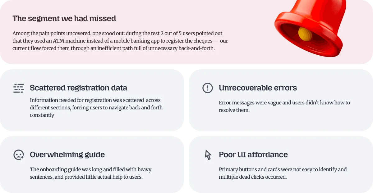
Observing users and analyzing the results revealed various challenges. Some issues were predictable. But one finding was completely unexpected — one that showed we had overlooked an entire user segment in the initial design.
Ideation
It was time to share insights with other teams. We held an ideation and review session with the product team. To better understand the problem space, we reframed each issue using a Problem → opportunity approach. Using an Impact-Effort Matrix, we prioritized solutions that would have the highest impact with the least technical effort.
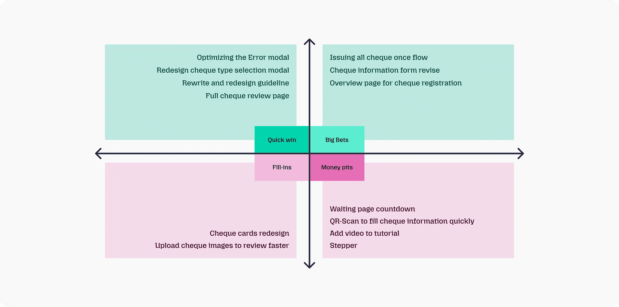
Then, we held feasibility sessions with the engineering team to assess the viability of each change. Rather than waiting for a big bang release, we decided to ship smaller changes earlier to improve the experience and to relieve pressure on the support team sooner.
Design
Restructuring the flow
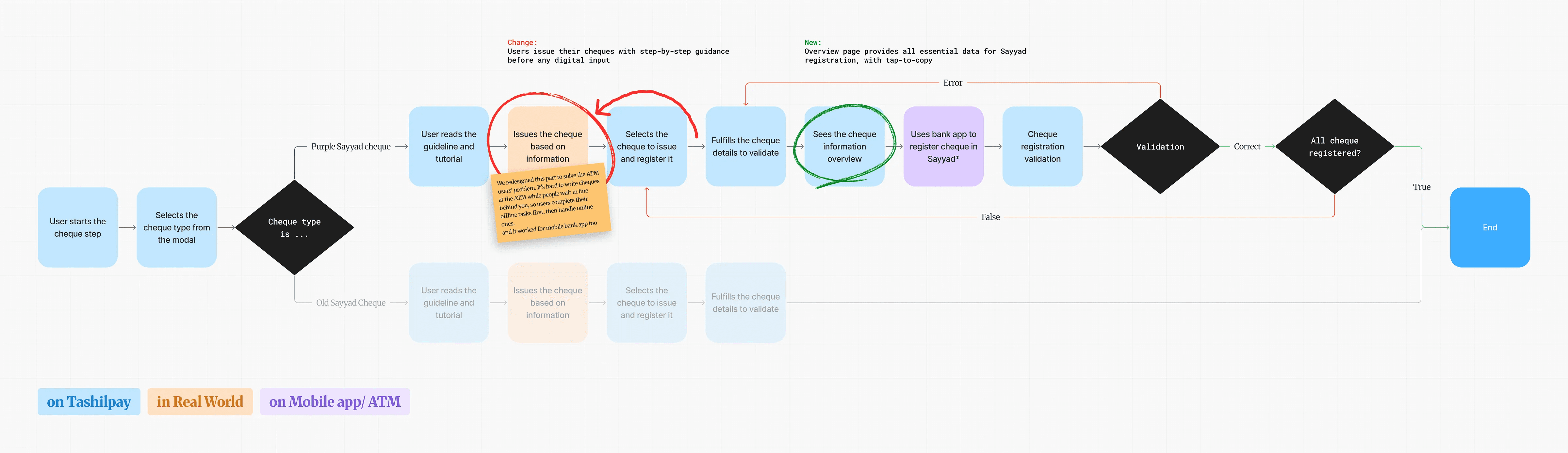
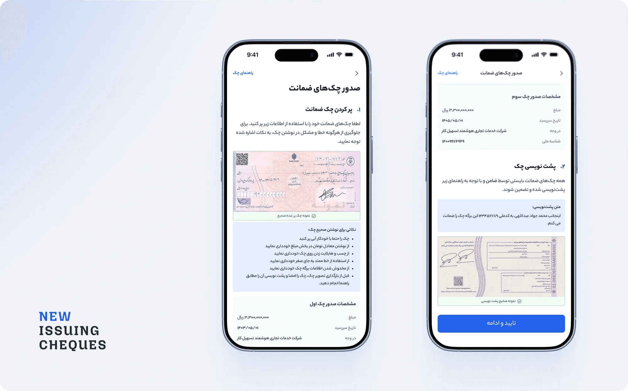
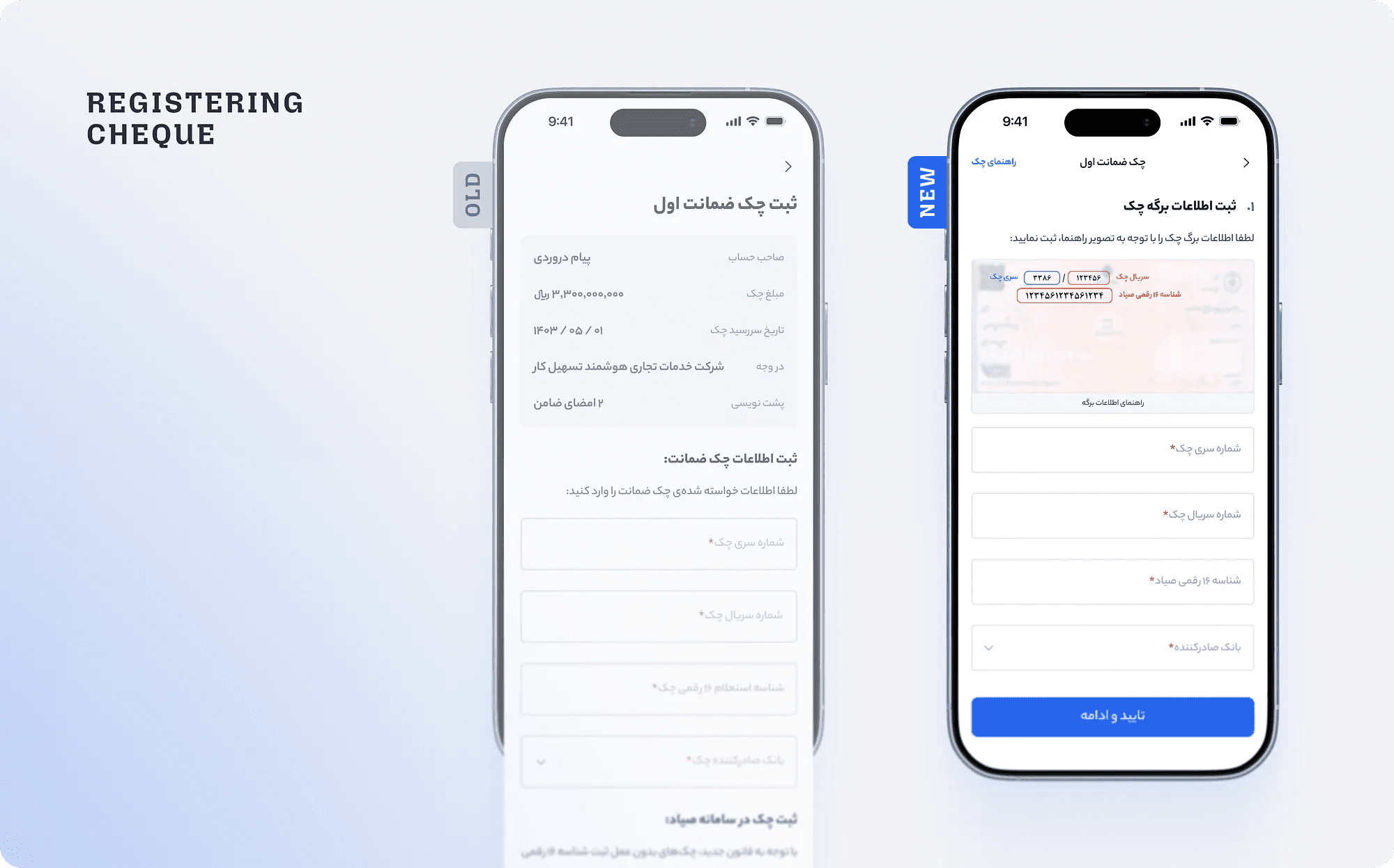
We split the flow into two distinct phases: issuing all cheques, then registering all of them one by one. This change not only solved the ATM segment issue but also aligned better with users’ mental models.
Adding an overview page
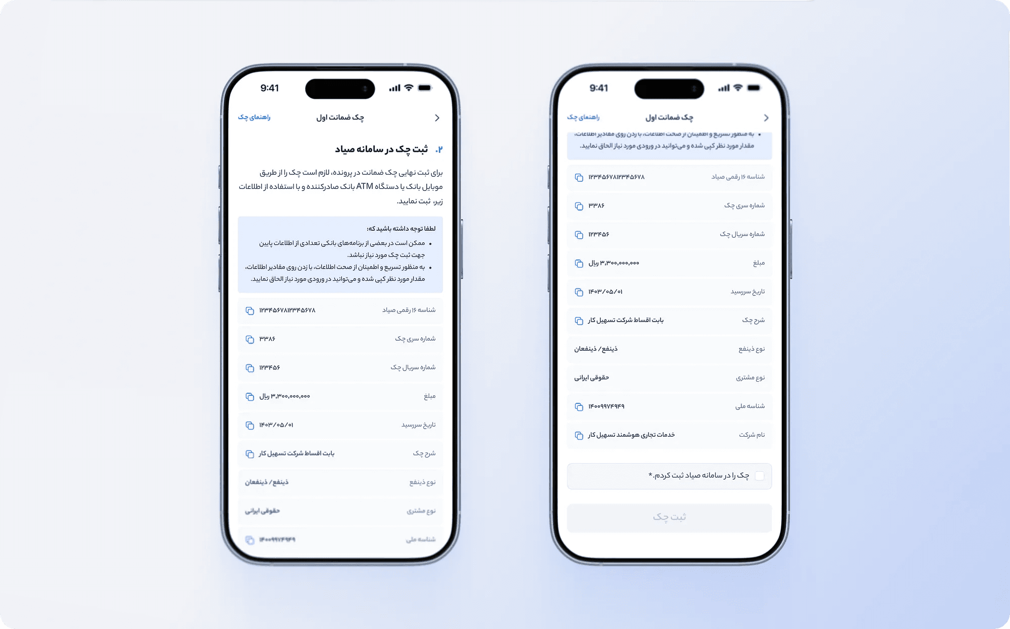
To make data transfer easier, we designed a dedicated page that displayed all the information users needed in one place. To streamline the process even further, users could copy any field with a single tap.
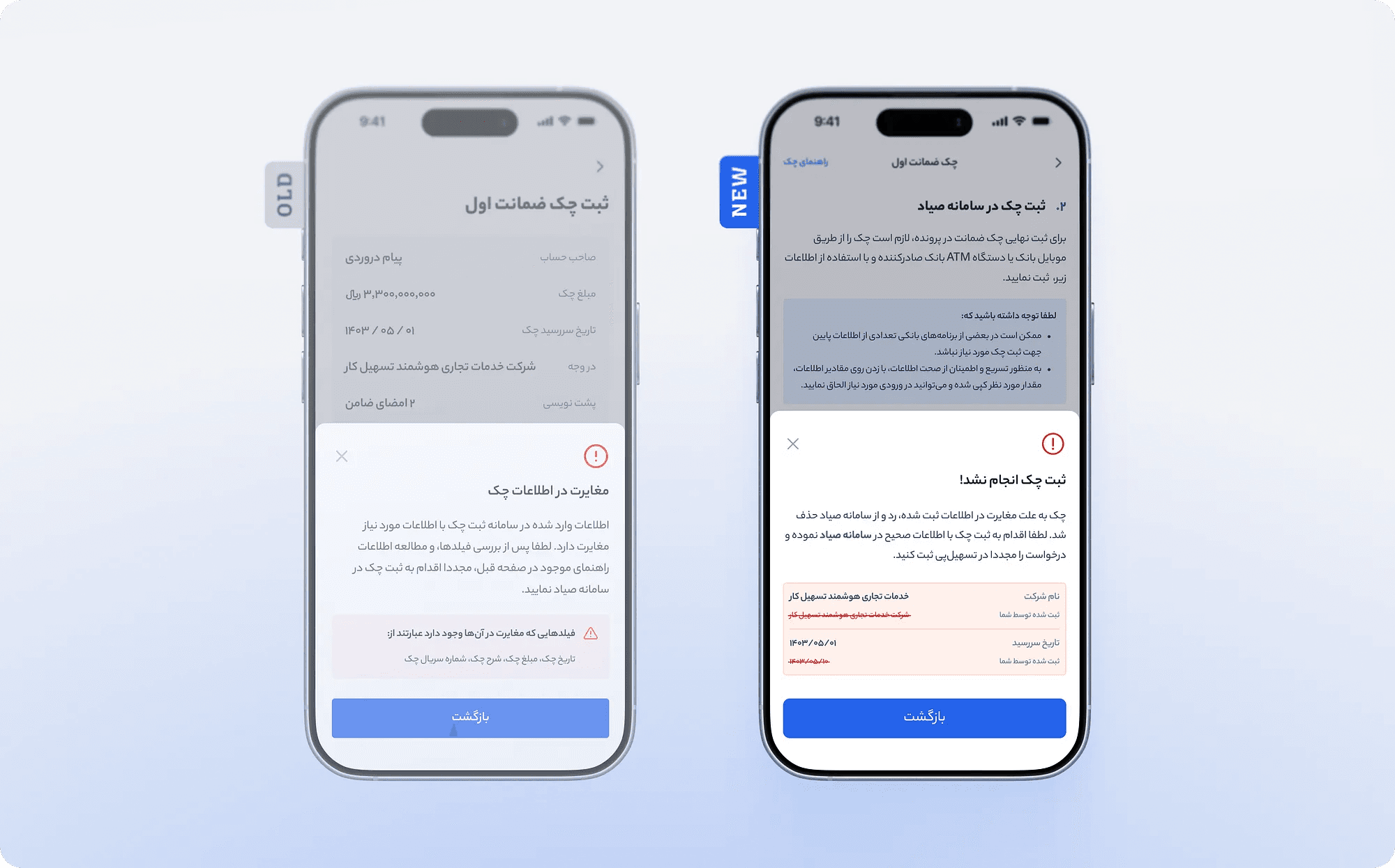
Rewriting and redesigning error modals
We rewrote all error messages with a focus on UX writing principles. Each error message clearly explains to the user what happened and what they need to do to resolve it.
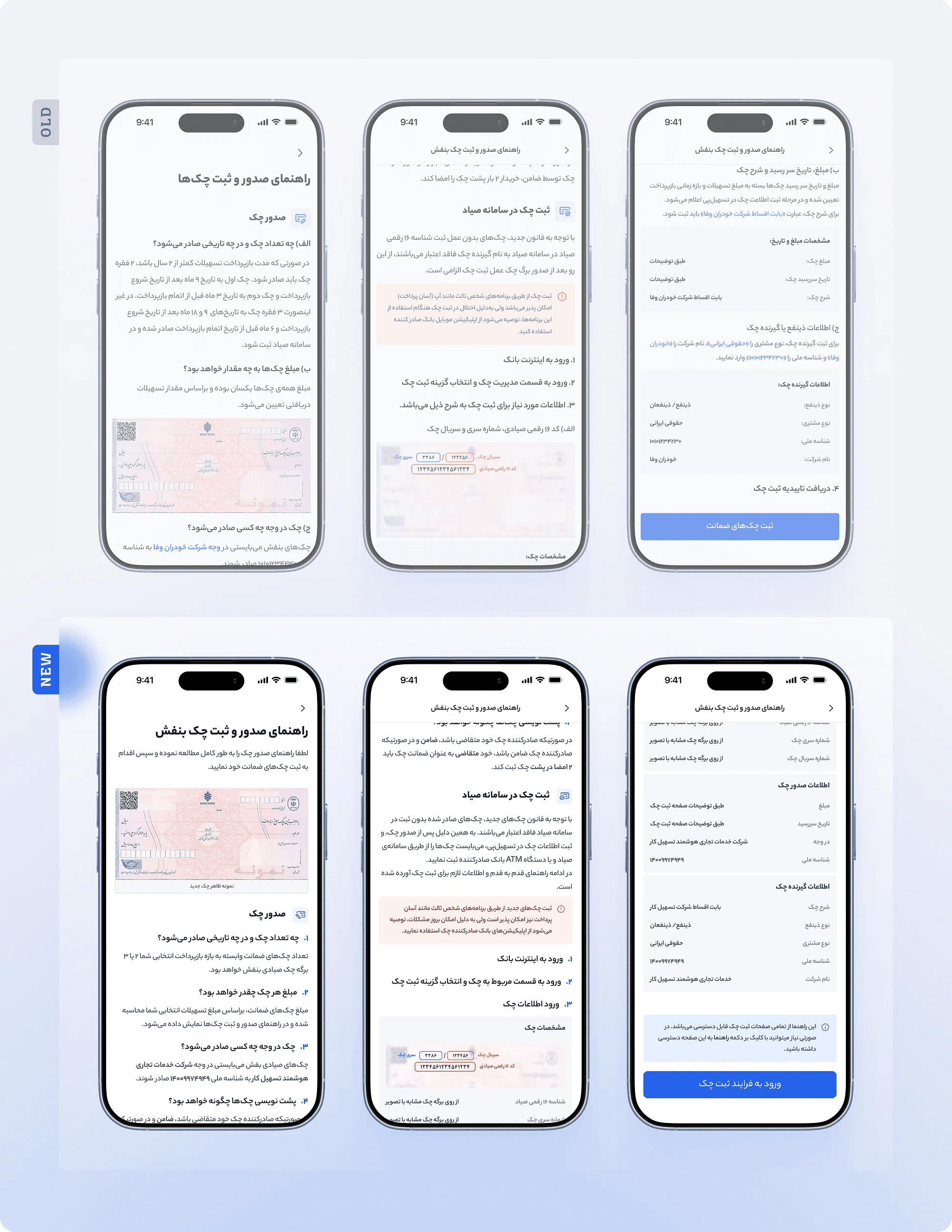
Design the guide from ground
The cheque guide was redesigned to be shorter, more scannable, and more visually digestible through concise bullet points and simplified content. Redundant information was removed to avoid repetition.
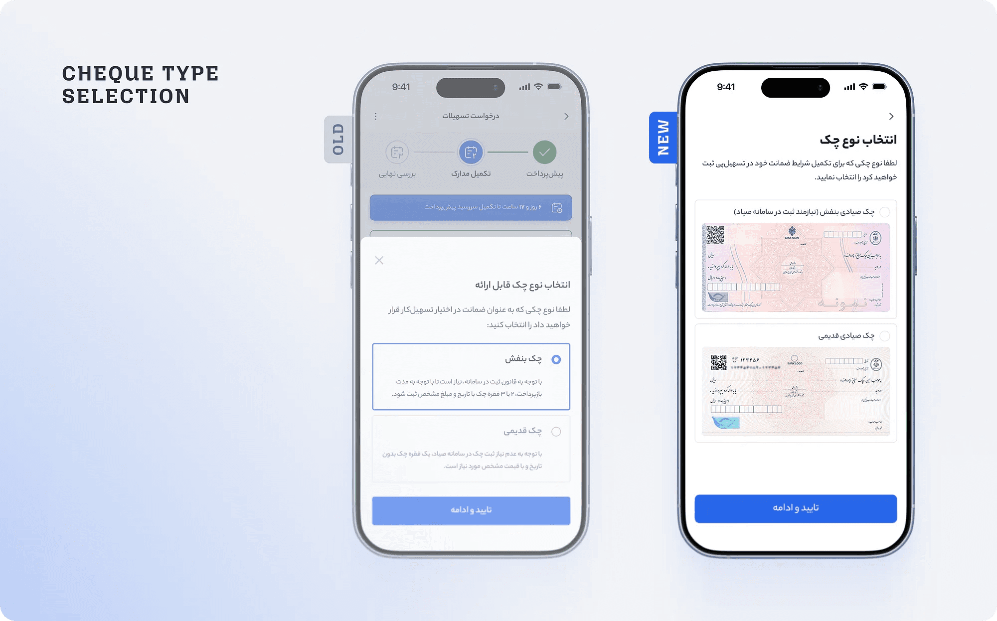
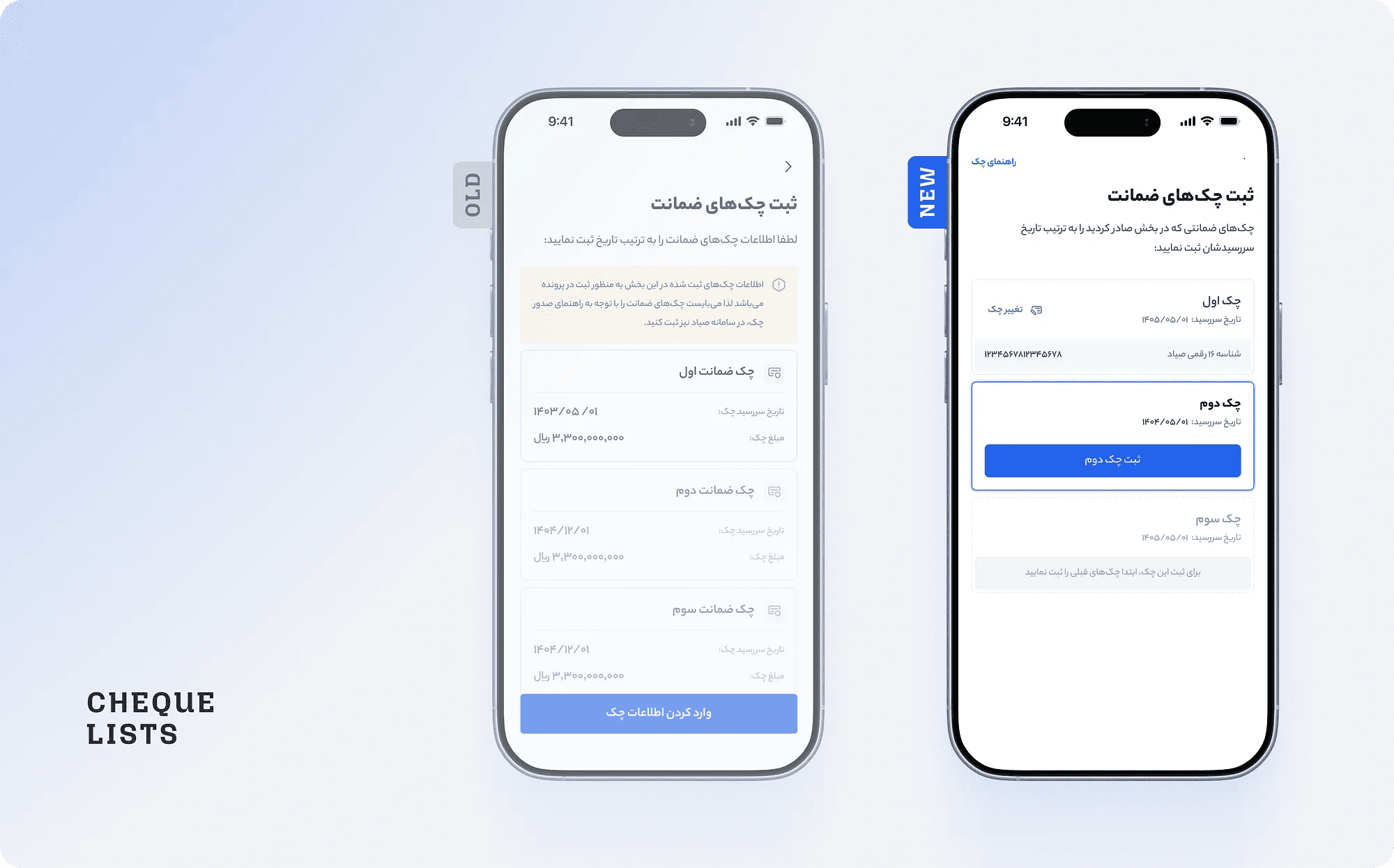
Revising existing components
Several components — such as the cheque type modal and cheque cards — were redesigned so that primary actions were clearly distinguishable and the components themselves helped users better understand the process.
Redesign Test
To measure the impact of redesign, we ran usability tests in a staging environment with 5 new users, using the same participant breakdown as before. Results showed:
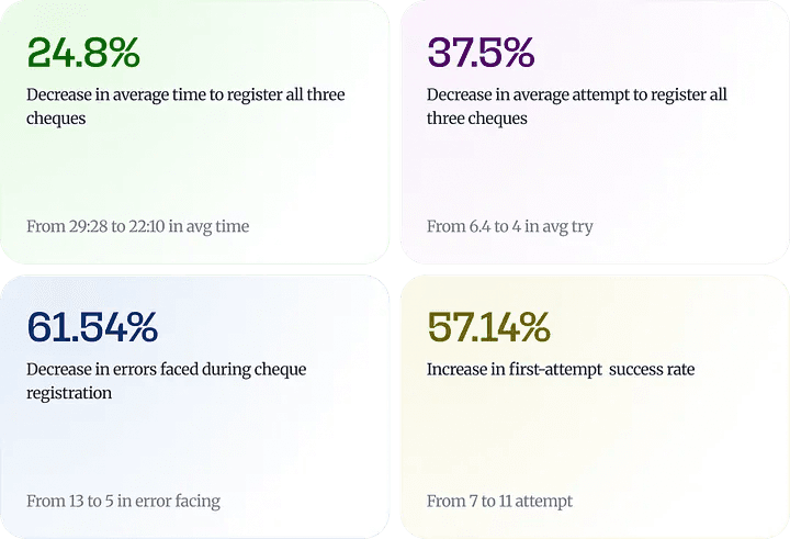
The data showed that users still benefited from a learning curve — registering subsequent cheques faster and with fewer errors — but unlike the old flow, this one also addressed the pain points we’d identified and worked seamlessly for ATM users.
Real world impact
After confirming the redesign’s effectiveness through testing, the new version was released to all users. A comparison of data from the three months before and after the release confirmed the operational success of the changes: The average time to complete the registration step decreased by 32%. The rate of error recovery improved by 83%, showing that friction points were eliminated and a smoother process for all segments.
Conclusion
Ultimately, we were able to uncover the pain points that were driving repeated support calls by directly engaging with users. By addressing them, we delivered a better user experience and accelerated the loan facilitation process — Tashilcar’s primary goal for Tashilpay.
Key learnings
Quantitative data confirms the problem but doesn’t reveal the root cause. Data told us something was wrong, but not why.
Some problems only surface through real usage. No matter how thorough the design process, some edge cases only appear when real users interact with the system. The ATM group is a great example.
An inclusive solution makes things better for everyone. The new flow designed considering ATM groups also improved the experience for mobile banking users — because it aligned better with everyone’s mental model.
Redesigning the collateral cheque registration in Tashilpay resulted in a 32% reduction in time-on-task and a 83% improvement in error recovery. But more importantly, it reminded us that even when we think we’ve covered every scenario, users always have something new to teach us.
The problem
Tashilpay is a financial platform built by the Tashilcar team to facilitate the car financing process — from loan application to installment management. Due to the company’s fast paced environment and tight deadlines, the initial version launched without user testing. A few weeks after release, support calls spiked.
Data from the call center team showed that roughly 7 out of every 10 calls were about the collateral cheque registration step. User logs confirmed that this step took 8 times longer than any other part of the flow. The cheque registration is inherently complex and time-consuming, but the data made it clear: our design had failed to ease users through it.
Sayyad is Iran’s centralized interbank cheque verification system, used to register and authenticate cheques digitally across all banks.
Discovering the issue
Before making any decision, we tried to extract as much information as possible from available tools. We had two main data sources:
The data confirmed that a problem existed, but it didn’t explain the root cause. After aligning as a team, we concluded that the existing data wouldn’t be enough to solve this — we needed to understand users’ actual experience directly.
User research
To understand exactly where and why users were struggling, we ran usability tests with real users. The goal was to observe their actual behavior firsthand and hear thoughts directly.
We invited 5 real users to come to the office and complete their actual collateral cheque registration, in person. To better distinguish between problems rooted in lack of knowledge versus problems caused directly by the design, we were intentional about who we invited: 2 users who were already familiar with the cheque process and 3 who were not.
Throughout the tests, participants were asked to think aloud as they worked and rate each task on a scale of 1 to 5 after completing each task. This approach allowed us to capture both their behaviors and their subjective experience of the flow.
Analyzing behavior
Data collected from the sessions revealed that a significant portion of the struggles were rooted in how users understood the process and how to complete it. That said, users became noticeably more comfortable after registering the first cheque — for the next cheques their errors and questions decreased. To map pain points more precisely, we used a User Journey Map. This helped us clarify UX challenges and identify opportunities for improvement.
Observing user behavior showed that the designed flow didn’t facilitate the process — instead, it forced users into constant back-and-forth cycles.
Key findings
Observing users and analyzing the results revealed various challenges. Some issues were predictable. But one finding was completely unexpected — one that showed we had overlooked an entire user segment in the initial design.
Ideation
It was time to share insights with other teams. We held an ideation and review session with the product team. To better understand the problem space, we reframed each issue using a Problem → opportunity approach. Using an Impact-Effort Matrix, we prioritized solutions that would have the highest impact with the least technical effort.
Then, we held feasibility sessions with the engineering team to assess the viability of each change. Rather than waiting for a big bang release, we decided to ship smaller changes earlier to improve the experience and to relieve pressure on the support team sooner.
Design
Restructuring the flow
We split the flow into two distinct phases: issuing all cheques, then registering all of them one by one. This change not only solved the ATM segment issue but also aligned better with users’ mental models.
Adding an overview page
To make data transfer easier, we designed a dedicated page that displayed all the information users needed in one place. To streamline the process even further, users could copy any field with a single tap.
Rewriting and redesigning error modals
We rewrote all error messages with a focus on UX writing principles. Each error message clearly explains to the user what happened and what they need to do to resolve it.
Design the guide from ground
The cheque guide was redesigned to be shorter, more scannable, and more visually digestible through concise bullet points and simplified content. Redundant information was removed to avoid repetition.
Revising existing components
Several components — such as the cheque type modal and cheque cards — were redesigned so that primary actions were clearly distinguishable and the components themselves helped users better understand the process.
Redesign Test
To measure the impact of redesign, we ran usability tests in a staging environment with 5 new users, using the same participant breakdown as before. Results showed:
The data showed that users still benefited from a learning curve — registering subsequent cheques faster and with fewer errors — but unlike the old flow, this one also addressed the pain points we’d identified and worked seamlessly for ATM users.
Real world impact
After confirming the redesign’s effectiveness through testing, the new version was released to all users. A comparison of data from the three months before and after the release confirmed the operational success of the changes: The average time to complete the registration step decreased by 32%. The rate of error recovery improved by 83%, showing that friction points were eliminated and a smoother process for all segments.
Conclusion
Ultimately, we were able to uncover the pain points that were driving repeated support calls by directly engaging with users. By addressing them, we delivered a better user experience and accelerated the loan facilitation process — Tashilcar’s primary goal for Tashilpay.
Key learnings
Quantitative data confirms the problem but doesn’t reveal the root cause. Data told us something was wrong, but not why.
Some problems only surface through real usage. No matter how thorough the design process, some edge cases only appear when real users interact with the system. The ATM group is a great example.
An inclusive solution makes things better for everyone. The new flow designed considering ATM groups also improved the experience for mobile banking users — because it aligned better with everyone’s mental model.